
Case Study: A Full-send Brand Launch with Hoot + Howl Spirits
- Aug 21, 2025
- 9 min read
Updated: Feb 17

Callan Deline’s bold, mountain-inspired spirits began with a passion for blending tradition and innovation and a love for hootin’ and howlin’ under the wide-open skies. It was a recipe for an innovative new Colorado spirits brand just waiting to be brought to life - this is the moment Turn It Up was built for.
Turn It Up provides an experience driven roadmap to bring your mountain top brand inspiration to life through a focus on four key phases: brand development, content creation, go to market, and media relations. With the framework and discipline of those specific phases we dig in to clearly define your intentions and goals before applying our experience and creative energy, transitioning your mountain top ideas into a tangible brand with a strategic go to market strategy.
Every brand has a unique soul, origin and mission and it’s our job to highlight and help define those elements to create an inspirational, noteworthy and attention grabbing vision. Whether you have just a name and idea for a brand or you have been in the trenches building your brand for a decade and are looking to reinvigorate your efforts and sales we can help.
We had a ton of fun getting to know Cal to understand his vision, aligning our team and processes to execute a full launch plan for Hoot + Howl in a unique and differentiated way that was authentic to his Colorado 7th generation roots and need for high elevation inspiration.
Phase 1 - Brand Development
Deline came to us with artisanal spirits (Armagnac bourbon, vodka, gin, triple sec and black tea liqueur), a name and a story behind it—the spirits brand is rooted in Deline’s experience full moon backcountry skiing with a group of friends, living in the moment and hooting and howling at the moon. The story not only painted a captivating picture, it provided the challenge for the brand - to capture the shared social energy and inspiration of the moment and mountains within a brand. It resonated perfectly with the Turn It Up ethos and founder, Chad Melis, who has shared similar experiences specifically hooting and howling at the moon with other groups on Berthoud Pass while doing full moon backcountry ski laps. Deline, an all-American skier, wanted to incorporate an element of the outdoors without pigeon-holing the brand as “whiskey for skiers.” He chose to work with TIU because we understand the energy and perspective you gain being outdoors and sharing moments with friends, whether biking, backcountry skiing or sharing beverages with buddies around the fire.
Branding work happens up front for focus, consistency and dicipline—in this phase, we work with brands to make decisions that will define their identity, from mission, vision and values to logo, font and colors—so we don’t end up making stuff that looks cool but doesn’t connect back to the intention. Our team immediately leaned into the concept of the words “Hoot” and “Howl” as verbs rather than nouns, emphasizing the adventure of the outdoors and the action of sharing a drink with friends. The decision set a dynamic tone for the rest of the developmental phase, as we worked closely with Hoot + Howl to develop the brand pillars, architecture, story, messaging and the structural work that defines the brand. Our goal was to create a strong foundation for an experience that resonates with consumers, retailers and distributors while retaining the founder’s vision.
Sometimes, the process requires adaptability on our part. As our brand team of Erik Cox, Carrie Weady and Chad Melis got to know Hoot + Howl, we learned more about their uncommon, patient and historically-inspired processes like tranchage, double distillation, “raising the barrel” and more—things that other distillers just aren’t doing. So, we drilled into those unique qualities, then adapted our strategy, weaving these points of differentiation into multi-channel messaging on the website and in press releases.
“Our approach includes a willingness to adapt and learn, to be open-minded and able to expand on the story to include some of those points of differentiation. Those things always existed in Hoot + Howl’s day-to-day operations, but they didn’t initially think to tell them because they’re not storytellers, they’re distillers. We uncover those details, articulate them and incorporate them into their story in a meaningful way,” said Chad.
The Logo Suite: Our team intentionally set out to capture the historic engagement of long lost distilling techniques with the desire for a modern and clean vibe and how those two interact in a way to capture the ENERGY of the Hoot + Howl mission. We were initially resistant to developing an owl-and-wolf motif for Hoot + Howl, out of concern that it would be too “on the nose.” However, after quite a few iterations falling short lead designer Cari Weady, an industry veteran with over 20 years of experience with New Belgium Brewery, created the wolf and owl logo mockup using negative space that teases the eye with an “ambiguous image”—a graphic that shifts to look like a wolf one moment and an owl the next. Observing the image creates an engaging, social experience and conversation the moment of joyful surprise as it tricks the brain; and the image ties in the outdoor roots of nature and resonated with the team so well that, despite our initial skepticism, it became the official logo mark.

“Part of any project is flexibility and doing what’s right for the project. At first we were convinced that we didn’t want to create an owl-and-wolf image, although we liked it we sat on it and didn’t share it with Cal as we were pushing to find another path. Ultimately it was a solid design, it stayed fresh with us and ultimately when we shared it with Cal it was an instant hit,” said Chad.
The Color: The logo suite was developed as a black and white one color palette which provides plenty of flexibility for use and opens a variety of options to play with background color. With a strong set of brand guidelines outlining usage, fonts, specs, use(s) and SKU colors we moved forward with sales tools, website, brand and social media assets selecting background color choices associated with priority/core SKUs to provide a simple and scalable decision making process for the future.

The Lockup: Have you noticed the plus sign that joins “Hoot” with “Howl?” Writing out “Hoot And Howl” was cumbersome, and using an ampersand seemed too predictable. We intentionally chose the plus sign symbol because of its brevity and unique, differentiated look. In the lockup, the plus sign is subtle, allowing the words to Hoot + Howl to shine while providing a unique way to represent the H+H brand in typed copy.
The Brand Story: Through the brand development process written copy was developed to communicate the brand's identity (outdoor inspired but the action of celebrating life’s moments amongst friends), voice (joyful but professional), and messaging that would be used ongoing to ensure consistency across all brand touchpoints as we develop the position in the drinkers mind.
The Packaging: Hoot + Howl not only had spirits to release immediately—they also had projects lined up for future release. This long-term vision presented both opportunity and challenge and prompted us to ask: how do we create a packaging process that’s scaleable, and takes into account not just today’s spirits, but future releases?
In an effort to differentiate on the shelf without the large spend of customized bottles, we employed a unique, two-step process. First, the glass bottle is printed with the Hoot + Howl wordstamp on the front and the story on the back panel. After it’s printed, it’s sent to the distillery, where the ink is used to orient the bottle while Hoot + Howl team fills the bottle and applies the label that corresponds with the spirit.

“We approached the packaging to represent a modern and clean vibe on a historic bottle shape that is affordable and repeatable,” said Chad. “We’ve worked on packaging in the beverage industry for 17 years. When you accumulate experience, you can anticipate challenges and solutions in advance—that’s why people come to Turn It Up.”
We initially designed nine labels for nine spirits. The design was intentional and strategic, allowing the Hoot + Howl team to apply labels easily at their facility, with some bold and special colors reserved for later releases and limited-edition spirits. For projects like these, we have the right people on the team who know how to execute and overcome variables and challenges that other agencies wouldn’t see coming.
PHASE 2 - Content Creation
This is where everything truly comes alive! Following the structure outlined in brand development, we bring the story to life through creative content development including copy, studio photography and lifestyle photography. Led by TIU Creative Director Michael Eldridge, we align with brand positioning to intentionally express the brand visually and start with studio photography, resulting in crisp, clean images that can be used for sales materials and on the website to communicate the brand effectively in an instant.
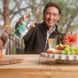
Then we move into lifestyle photography. For Hoot + Howl, that meant shooting riverside in Lyons, Colorado, creating and capturing outdoor moments like folks celebrating together, making cocktails and hanging out outside. While the setting was outdoors, the focus was on the spirits, including triple sec, black tea liqueur, and the flavors that create social moments and get people hooting + howling together. The resulting photos express the essence of the brand with imagery that bares its soul at a glance.


Ally Levise continued to develop the Hoot + Howl brand story through creative copywriting in support the ongoing needs of the brand launch as we referenced the early established brand foundation efforts and expanded the brand story and messaging to further incorporate the unique distilling processes and joyful moments celebrated amongst friends developed for specific uses from website, sales tools, social media posts and media relations communications.
PHASE 3 - Go to Market
Strategy meets execution during the go to market phase. Our team combines copy and images with web best practices to bring the brand to consumers with a stunning website; and works to meet the needs of distributors and industry pros with high-impact sales tools.
Website: Hoot + Howl’s site is a user-friendly megaphone for the brand that tells the story and communicates the mountain-inspired, energetic feeling of their products. Turn It Up provides full-service website development with help from industry pro and graphic artist Jeremy Farmer.
“Your website is the digital cultural home and tasting room of your brand. Not everyone can walk through the front door and experience Hoot + Howl firsthand, so the website gives them a chance to tell their story to people both near and far,” said Chad.

Sales Tools: We create a retail sales deck, sale sheets, point-of-sale items and more, so brands like Hoot + Howl can efficiently sell their products to liquor stores, bars and restaurants with a professional deck that speaks their language. The team has over 20 years of experience in developing the tools that sales people need, and those that bring the brand message to life on the shelf in a way that’s both eye-catching and complementary to the packaging.
Retail Sales Deck:

Social Media:
The final step in the go to market phase is developing social media assets. We created a nine-square graphic for Hoot + Howl’s Instagram page to post in alignment with an embargo media relations timeline. Everything went live the morning before launch, so people could see the fully developed brand on the website and go to Instagram to see a grid that encompasses high quality and essential brand elements: an outdoor vibe, crisp studio images and lifestyle photos of folks living in the moment with a cocktail in hand.

PHASE 4 - Media Relations
Once the brand is locked down, the packaging is ready to go, content has been created, and sales tools are in place, TIU shares your story with the world. For Hoot + Howl’s launch, we used an embargo strategy to align timelines. The team reached out to Westword, a well-known Denver publication that we’ve worked with many times in the past, for an exclusive behind the scenes interview with Cal and Chris at the distillery for the first announcement.
After Westword’s announcement, the team executed a wider outreach push. Using tailored messaging and curated media lists and a mix of tactics including press releases, media alerts, samples, recipes we introduced writers the H+H narrative and provided narratives and photography that would entice spirits lovers, emphasizing Hoot + Howl’s unique processes and flavors. The media relations team developed targeted both consumers and industry professionals with specific goals in mind.
Colorado Consumer: We crafted specific language for the Colorado consumer and expanded the narrative to encompass the uniqueness of the H+H processes to the National media introducing the brand and starting the journey of brand awareness and affinity with a local focus and national scope.

Industry Publications: With the goal of developing distributor awareness and interest and using proven industry publications to drive retailer confidence earning shelf space and driving points of distribution we introduced the industry to the Hoot + Howl brand—a must for emerging brands.

Virtual Tastings: In addition to traditional tactics mentioned above, our media team executed familiarity trips for local writers and a virtual spirits tasting, inviting hand-selected Colorado and National writers to introduce the brand and engage meaningful conversations with Cal and Chris supporting the historical processes and approach of the brand while allowing them to taste the product from the comfort of their home. Participants were sent samples, tasting cards, swag and participated in a one hour sampling led by Callan Deline and Hoot + Howl’s head distiller Chris Ritenour, who shared stories about their processes and vision. The tasting was lively, fun, informative and resulted in coverage while building relationships with writers to foster into future earned media placements.


Looking forward
For Hoot + Howl, the story is just beginning. They’re currently self-distributing in Colorado’s Front Range, but the next, natural step is to align with a distributor and grow their reach. At TIU, we’re preparing the brand for future growth through building awareness and strength of brand. With a robust foundation already in place, Hoot + Howl is poised to thrive for years to come.
Do you have a brand or product that could use a full-send marketing launch? Hit us up for brand development, content creation, go to market and media relations, or mix and match marketing services according to your needs. TIU’s team of passionate creators is here to consume, collaborate, create and celebrate with you.


Comments